Your Homepage Is Costing You Clients: 7 Fixes You Can Make This Weekend

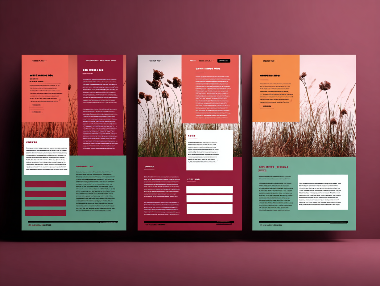
Your homepage is not a brochure.
It’s not a “pretty front door.”

It’s the place where your best-fit people decide, in seconds, whether to:

  • Take the next step with you
  • Or click away and never come back

Most solo service providers have a homepage problem, not a traffic problem. People do show up—they just don’t stick around or convert.

The good news? You don’t need a full rebrand. You can make real improvements in a weekend if you focus on the right things.

Let’s walk through 7 practical homepage fixes that can actually move the needle.


1. Decide the main job of your homepage

If your homepage is trying to do 12 things at once, it will fail at all of them.

Ask yourself:

“If someone only visits my homepage, what’s the one action I most want them to take?”

For a solo service provider, that might be:

  • Book a discovery call
  • Check out your main service
  • Join your email list (if that list is strategically tied to a core offer)

Everything on the page should support that primary action.

That doesn’t mean you can’t have secondary links. It means:

  • One primary CTA
  • One clear path for people who are a good fit
  • Less “choose your own adventure,” more “here’s what makes sense next”

If your homepage currently has:

  • “Work with me”
  • “About me”
  • “Shop”
  • “Freebie”
  • “Blog”
  • “Speaking”

…all shouting at the same volume, that’s noise. Pick one thing to be the star.


2. Fix your hero section: what, who, outcome

Your hero section (the first screen of your homepage) is where most of the decision happens.

In 5–7 seconds, a visitor should be able to answer:

  1. What do you do?
  2. Who is it for?
  3. What outcome do you help them get?
  4. What should they do next?

If your hero currently says something like:

  • “Welcome to my website”
  • “Helping you live your best life”
  • “Designer. Strategist. Dreamer. Creator.”

…that’s not helping anyone.

Use a simple structure:

  • Headline: For [who], I [do what] so they can [outcome].
  • Subheadline: One or two lines that give a bit more context.
  • CTA button: The primary next step (“Book a Call”, “View Services”, “Get the Checklist”).

Example:

Headline: “Simple launch-ready websites for solo service providers who are tired of tech drama.”
Subheadline: “I build clean WordPress sites and funnels that help you look legit, book more clients, and stop duct-taping your online presence together.”
Button: “See How We Can Work Together”

Is it fancy? No. Is it crystal clear? Yes. That’s the point.


3. Cut the fluff and talk like a human

A lot of homepages sound like they were written by a committee trying to impress a board of directors.

You are a solo or small service provider. People hire you, not an abstract brand.

Look at your homepage copy and ask:

  • Would I actually say it like this out loud?
  • Is this how my ideal client talks about their problem?
  • Could a normal person repeat what I do after reading this once?

Trade vague lines like:

  • “I empower entrepreneurs to scale their impact”

For grounded ones like:

  • “I help small business owners clean up their websites and funnels so more clicks turn into clients.”

You’re not trying to sound “big.” You’re trying to sound useful and trustworthy.


4. Make your services path obvious

Your homepage should make it stupid easy to understand:

  • What you offer
  • Who each offer is for
  • How to learn more or take the next step

You do not need to spell out every detail on the homepage. But you should:

  • Clearly name your main service(s)
  • Provide a one-sentence explanation for each
  • Link to a dedicated page for details

Example:

Done-For-You Website Build
For solo service providers who want a clean, conversion-focused WordPress site built for them in 4–6 weeks.
[Learn more ➜]

Launch Support & Funnel Cleanup
For business owners with existing offers who need their funnels and tech fixed before the next launch.
[See how it works ➜]

Group Support & Implementation Community
For entrepreneurs who want ongoing help, feedback, and tech support while they build.
[Join the community ➜]

Even if you only have one main service, show it clearly instead of burying it two clicks deep.


5. Use social proof like a grown-up, not like a collage

Social proof is not about volume. It’s about relevance and clarity.

On your homepage, pick 2–5 pieces of proof that best support your main service and your main CTA.

That might be:

  • Short client quotes
  • Before/after statements (“Went from X to Y”)
  • Logos of brands or types of clients you’ve worked with
  • Simple stats (“60% opt-in rate”, “booked out in 3 weeks”, etc.)

Make each piece easy to skim:

  • Highlight the key outcome in bold or as a pull quote
  • Put the rest in smaller body text if needed
  • Attribute it to a real person if you can (first name and role is enough)

Don’t shove 20 screenshots into a slider that no one will click through.
Think: “What would help a skeptical but interested person feel safer taking the next step?”


6. Reduce friction: design, load time, and navigation

Bad experience kills conversion, even with good messaging.

Check your homepage for these friction points:

Slow load time

  • Huge uncompressed images
  • Autoplay videos
  • Heavy scripts you don’t need

If your homepage takes forever to load on a phone over regular data, people will just bounce.

Crowded layout

  • Tiny text
  • No white space
  • 4–5 fonts fighting for attention
  • Random elements that don’t serve the main goal

Your homepage should feel like a clear conversation, not a crowded bulletin board.

Confusing navigation

  • Too many menu items
  • Nested menus that go three levels deep
  • Jargon as menu labels

Keep your main nav simple:

  • Home
  • Services / Work With Me
  • About
  • Resources / Blog
  • Contact

That’s it. You can tuck the rest into the footer or a resources hub.


7. Add clear, repeated calls to action

Most homepages have either:

  • No real calls to action, or
  • A single “Contact” link in the top right and nothing else

You want multiple, consistent opportunities for someone to take the next step as they scroll.

For example, if your primary goal is to book calls:

  • CTA in the hero section
  • CTA after your services overview
  • CTA near the bottom of the page

All pointing to the same place: your booking page or your “Work With Me” page.

Use action-oriented language that tells them what they get:

  • “Book a free 20-minute consult”
  • “See how we can work together”
  • “Get help cleaning up your funnel”

You’re not begging. You’re leading.


How to tackle this in a weekend (without getting lost)

Here’s one way to structure your time:

Day 1

  • Decide the primary job of your homepage
  • Rewrite your hero section (headline, subheadline, CTA)
  • Clean up your main navigation

Day 2

  • Clarify and rewrite your services section
  • Choose and format a few strong pieces of social proof
  • Add or refine calls to action throughout the page
  • Do one pass to remove jargon and make your copy sound like a real person

No, you won’t have a perfect homepage by Monday. But you’ll have a much clearer, cleaner, more effective one—and that alone can improve conversion.


Want help turning your homepage into a real client-getting asset?

If you’re looking at your homepage thinking, “I know this isn’t right, but I don’t know how to fix it without burning the whole thing down,” you are exactly my kind of person.

Inside Launch Squad, we:

  • Audit and improve real websites and funnels
  • Help you clarify your message and offers
  • Fix tech and layout issues that quietly kill conversions
  • Give you feedback while you implement, so you’re not guessing alone

You don’t need another vague course telling you “just show up and add value.”
You need a clean, working digital experience that makes it easy for the right people to say yes.

Join Launch Squad: https://letsjustlaunch.com/squad

Ready to stop researching and actually launch?
Get my free Weekend Launch Checklist—the exact steps I use to take projects from zero to live in 48 hours.

Leave a Reply

Your email address will not be published. Required fields are marked *

Hey, I'm Jen

I’m a digital experience architect who’s spent 25+ years making other people’s funnels actually work. Now I help heart-driven solo entrepreneurs stop overthinking, clean up their tech, and finally launch what they’re called to build—without the hype or burnout.

Related News & Articles

© 2025 Let’s Just Launch LLC. All rights reserved. This site is operated by Let’s Just Launch LLC and is not affiliated with or endorsed by Facebook™, Google™, YouTube™, or any other platform. All content is for educational purposes only and does not constitute financial, legal, or professional advice. Results are not guaranteed and depend on your own effort, background, and implementation. Some recommendations may include affiliate links that provide a commission at no extra cost to you; we only promote tools we personally use and believe in. By purchasing through this site, you agree to our Terms & Conditions, Privacy Policy, and Refund Policy. We respect your privacy and will never sell or share your information without consent. Let’s Just Launch LLC is founded on Christian values but welcomes all.
.