A lot of service-provider websites have the same problem.
They look fine.
Nice fonts. Nice colors. Decent photos. Maybe even some fancy animations sliding around like they’re auditioning for a Squarespace commercial.
And yet somehow… nobody’s contacting you.
Or worse:
people are contacting you, but they’re confused, unqualified, price shopping, or asking for things you don’t even do.
That’s usually not a traffic problem.
It’s a clarity problem.
Your homepage has one job:
help the right person immediately understand:
That’s it.
Not your life story.
Not twelve offers.
Not a scavenger hunt.
Just clarity.
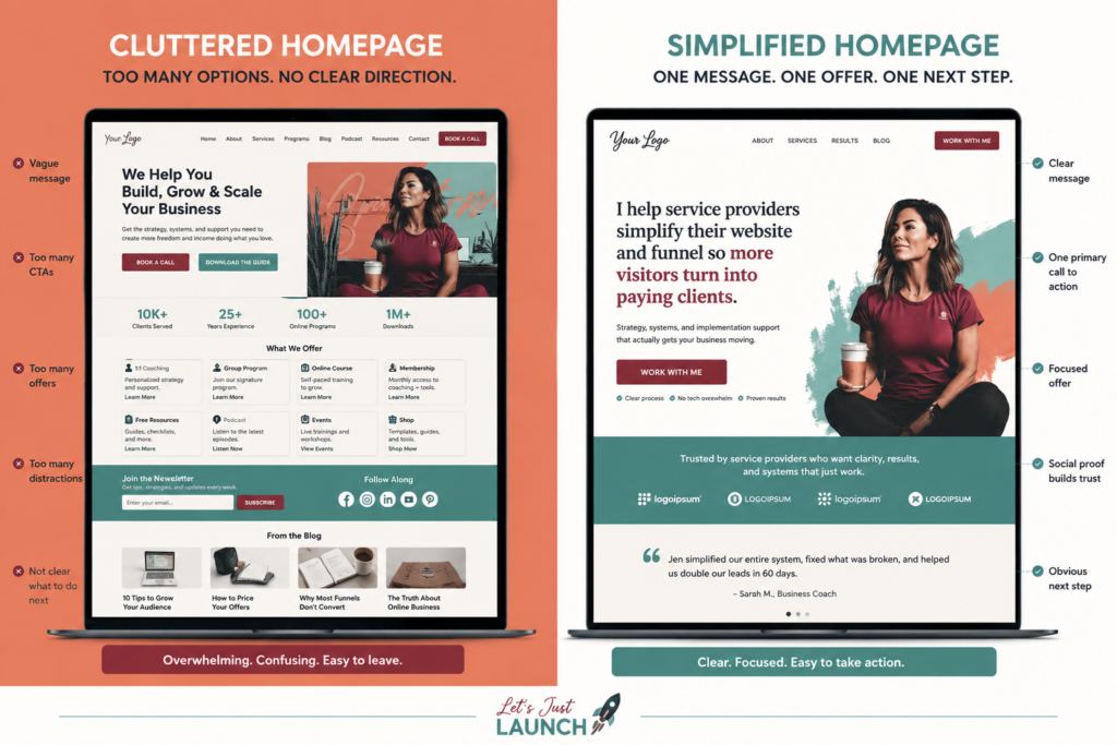
Most Homepages Are Trying to Do Five Jobs at Once
This is where things start falling apart.
A lot of business owners build homepages like junk drawers.
They keep adding things because they’re afraid to leave anything out.
So now the homepage is trying to:
And somewhere in the middle of all that, the actual customer quietly leaves.
Because overwhelmed people do not make decisions faster when you give them more information.
They stall.
The Real Question Your Homepage Needs to Answer
Visitors are asking one question:
“Am I in the right place?”
Not:
“Is this founder creative?”
Not:
“How many animations can this site load before my laptop catches fire?”
They want orientation.
Good homepages reduce cognitive load.
Bad homepages increase it.
The best-performing sites are usually painfully clear.
Not clever.
Clear.
There’s a difference.
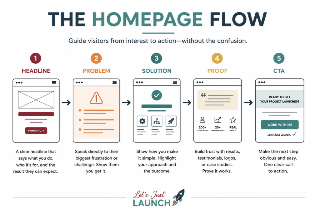
Here’s the Homepage Formula Most Service Providers Actually Need
Honestly, most solo service providers do not need a revolutionary website structure.
You probably need:
That’s it.
Your homepage should feel like a calm tour guide.
Not Times Square.
Signs Your Homepage Is Confusing People
Here are a few common symptoms.
Your headline is vague
If your headline says something like:
“Helping Visionaries Unlock Transformation Through Authentic Alignment”
…respectfully, nobody knows what that means.
Say what you do.
Plainly.
Example:
“I help service providers simplify their website and funnel so more visitors turn into paying clients.”
Clear beats impressive almost every time.
You have too many calls to action
If your homepage has:
…your visitor is now managing options instead of making decisions.
Pick the primary action.
Support it.
Repeat it.
Your services are fragmented into seventeen tiny offers
This happens constantly.
People create a separate offer for every skill they have.
Now the visitor is trying to decode:
Meanwhile they still don’t know the actual outcome.
People buy outcomes.
Not menu complexity.
Your Homepage Is Not a Resume
This one hurts a little because experienced people naturally want to prove themselves.
I get it.
But visitors do not need your entire history before taking the next step.
They need confidence that:
That’s different from listing every credential since 2007.
Experience matters.
But relevance matters more.
The Biggest Mistake: Leading With Process Instead of Pain
A lot of websites immediately start explaining:
But the customer is still over there wondering why their leads disappeared after clicking the ad.
Start with the friction they already feel.
Examples:
That’s the conversation already happening in their head.
Meet them there first.
Your Homepage Should Reduce Anxiety
This part matters more than people realize.
Good conversion strategy is often just anxiety reduction.
People hesitate when:
Your homepage should quietly communicate:
“You’re in the right place. This is manageable. Here’s what happens next.”
That’s why simple websites often outperform “impressive” ones.
Less friction.
More movement.
A Better Homepage Test
Forget asking:
“Does this look modern?”
Ask:
That last one matters.
Because most of your audience is already overwhelmed before they even land on your site.
Don’t make them work harder.
Final Thought
Most websites don’t fail because the owner isn’t talented.
They fail because the messaging became bloated, fragmented, and overly complicated.
And honestly?
The internet keeps rewarding people for adding more.
More funnels.
More offers.
More automations.
More words.
More steps.
Meanwhile the businesses quietly making money are often doing something much less exciting:
They made it easy to understand what they do.
They made it easy to buy.
And they kept going long enough for momentum to compound.
That’s usually the game.
Not perfection.
Not complexity.
Clarity.